Visualizing Project Plans with Charts
Farline AI provides three visualization formats for your project plan timelines: Excalidraw hand-drawn charts (default), Mermaid text-based charts, and DayPilot interactive charts.
Chart Formats
Use the format toggle above the chart to switch between views. Excalidraw is selected by default.
Excalidraw Charts (Default)
Hand-drawn style project plan forecast charts with a clean, visual aesthetic.
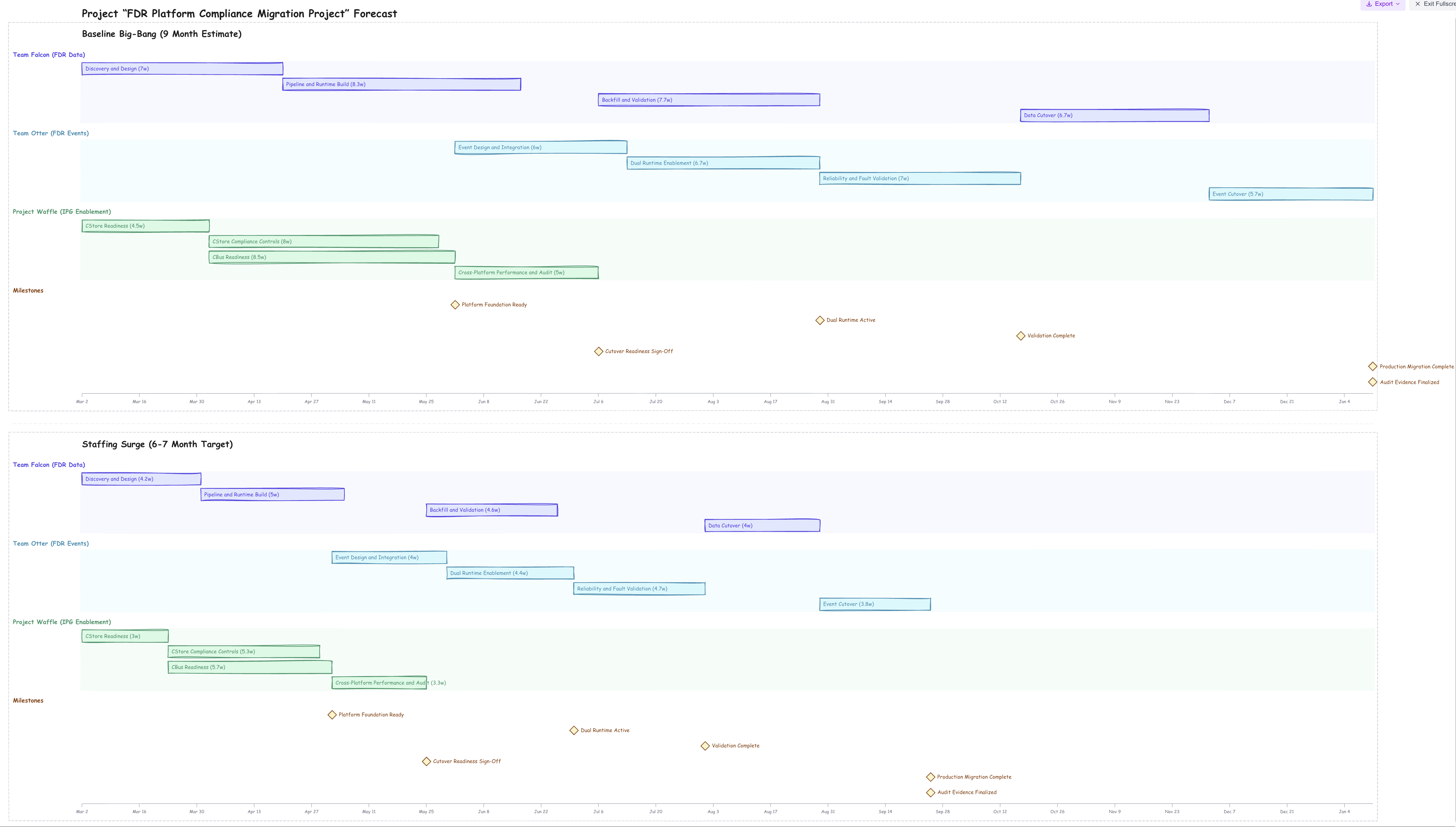
Benefits:
- Hand-drawn visual style that's easy to read and visually appealing
- Each work item on its own row, grouped by workstream
- Color-coded workstream sections with background bands
- Milestones shown as diamond markers on the timeline
- Responsive layout that fills available screen width
- Export as
.excalidraw, PNG, or SVG - Open directly in excalidraw.com with one click
- Fullscreen mode for presentations and screenshots
- Updates in real time as your project definition changes
Best for:
- Day-to-day project plan planning and review
- Presentations and stakeholder communication
- Exporting editable diagrams to Excalidraw
- Quick visual overview of multi-scenario forecasts
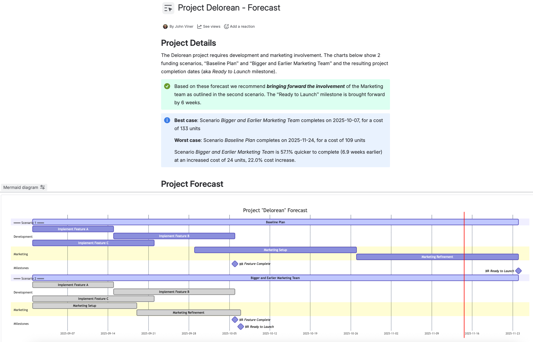
Mermaid Charts
Text-based project plan forecast charts perfect for documentation and sharing.
Benefits:
- Copy chart syntax to clipboard
- Paste into Confluence, Notion, GitHub, or any Mermaid-compatible tool
- Version control friendly (text-based)
- Lightweight and fast rendering
- Proportional swimlane heights based on workstream capacity
Best for:
- Documentation and wikis
- Sharing in tools that support Mermaid
- Version-controlled project plans
- Embedding in Confluence or GitHub
DayPilot Interactive Charts
Interactive timeline visualization with rich features.
Benefits:
- Interactive timeline with drag-and-drop
- Color-coded by workstream
- Detailed tooltips and context menus
- Professional presentation quality
- Proportional swimlane heights showing relative team sizes
Best for:
- Interactive exploration of timelines
- Detailed project analysis
- Professional reporting
Exporting Charts
Excalidraw Export
Excalidraw charts offer the most export options:
- Download .excalidraw file - Editable diagram file. Open in excalidraw.com, Obsidian, or VS Code to edit, annotate, and restyle.
- Download PNG image - High-resolution (2x retina) raster image. Ready to paste into presentations, docs, or emails.
- Download SVG image - Scalable vector image. Stays crisp at any size — ideal for print or large displays.
- Open in excalidraw.com - Uploads your chart and opens a direct link in the browser-based editor with all elements editable.
- Fullscreen + Screenshot - Enter fullscreen mode for a clean capture, then use your OS screenshot tool.
Mermaid Export
For Mermaid charts:
- Click "Copy to Clipboard" button
- Paste into your tool of choice
- Chart renders automatically in Mermaid-compatible apps
Screenshot
For any chart type:
- Use your OS screenshot tool
- Capture the chart area
- Paste into presentations, docs, or emails
Tip: Use fullscreen mode (available on Excalidraw charts) for cleaner screenshots.
Using Charts in Confluence
Export your Farline AI timelines to Atlassian Confluence in just a few steps.
Using Excalidraw Export (Recommended)
- Download the
.excalidrawfile from the Export menu - Open the file in excalidraw.com
- Export as PNG or SVG from Excalidraw
- Upload the image to your Confluence page
- Re-export when your project changes
Using Mermaid Syntax
- Click "Copy to Clipboard" on the Mermaid chart
- Install a Mermaid app in Confluence (search "Mermaid Charts & Diagrams" in Atlassian Marketplace)
- In edit mode, type
/mermaidor use Insert menu - Paste the copied Mermaid code
- Chart renders automatically
Using Charts in Other Tools
Excalidraw-Compatible Tools
Download the .excalidraw file and open in:
- excalidraw.com - Free browser-based editor
- Obsidian (with Excalidraw plugin)
- VS Code (with Excalidraw extension)
GitHub/GitLab
Markdown files support Mermaid:
```mermaid [paste Mermaid syntax here] ```
Notion
- Create a code block
- Set language to "Mermaid"
- Paste syntax
PowerPoint/Google Slides
Export as PNG for quick insertion, or SVG for crisp scaling at any size. Both are available directly from the Export dropdown on Excalidraw charts.
Chart Features
Timeline View
All chart formats show your complete project timeline:
- Start/end dates for every work item
- Duration shown as bar length with weeks label
- Milestones marked at completion points
- Workstream grouping with color coding
Work Item Details
In Excalidraw charts:
- Work item name with duration (weeks)
- Color-coded bars grouped by workstream
- One row per work item for clear reading
- Diamond markers for milestones
- Shared time axis with date markers
In Mermaid charts:
- Work item name and duration bars
- Sequence and dependencies
- Proportional swimlane heights
In DayPilot charts:
- All of the above, plus interactive tooltips, context menus, and zoom/pan controls
Customizing Visualization
In Farline AI
Chart appearance is automatic based on your project definition:
- Workstream names become color-coded sections
- Work item sizes determine bar lengths
- Dependencies create scheduling relationships
- Capacity affects layout
In Excalidraw
After exporting the .excalidraw file:
- Rearrange, resize, or restyle any element
- Add annotations, arrows, or notes
- Change colors and fonts
- Group or frame elements
Note: Changes in external tools won't sync back to Farline AI. Regenerate charts from the project definition for updates.
Troubleshooting
Chart Too Wide
Solutions:
- Reduce number of concurrent work items
- Split into multiple scenarios
- Use shorter work item names
- Scroll horizontally (most tools support this)
Can't See All Workstreams
Check:
- All workstreams are defined in the project definition
- Forecast ran successfully
- Scroll down to see more swimlanes
Excalidraw File Looks Blank
If the exported .excalidraw file appears blank in excalidraw.com:
- The chart should auto-center on load. Try pressing Ctrl+Shift+1 to fit to screen
- Ensure your project has forecast data (at least one scenario with scheduled work items)
Chart Not Rendering in Confluence
Check:
- Mermaid app is installed and active
- You used the Mermaid macro (not a regular code block)
- Syntax was copied completely (not truncated)
Best Practices
For Day-to-Day Planning:
- Use Excalidraw charts (default) for a clear visual overview
- Switch between scenarios to compare timelines
- Use fullscreen mode when presenting to stakeholders
For Documentation:
- Export Excalidraw files for editable diagrams
- Use Mermaid charts for version-controlled documentation
- Regenerate charts when project changes
For Presentations:
- Use Excalidraw fullscreen mode for clean screenshots
- Export to excalidraw.com and save as SVG for crisp scaling
- Highlight key milestones and completion dates
For Sharing:
- Export Excalidraw file for teams that use diagramming tools
- Use Mermaid syntax for technical teams on GitHub/Confluence
- Screenshots for executives/non-technical stakeholders
Related Articles
- Getting Started with Farline AI - Learn the basics
- Using the Advanced Editor - How to define projects
- Using the AI Project Builder - Build projects conversationally
- Understanding the Forecast Results - Reading the results tab
Last updated: 2026-02-15